All The Seasons
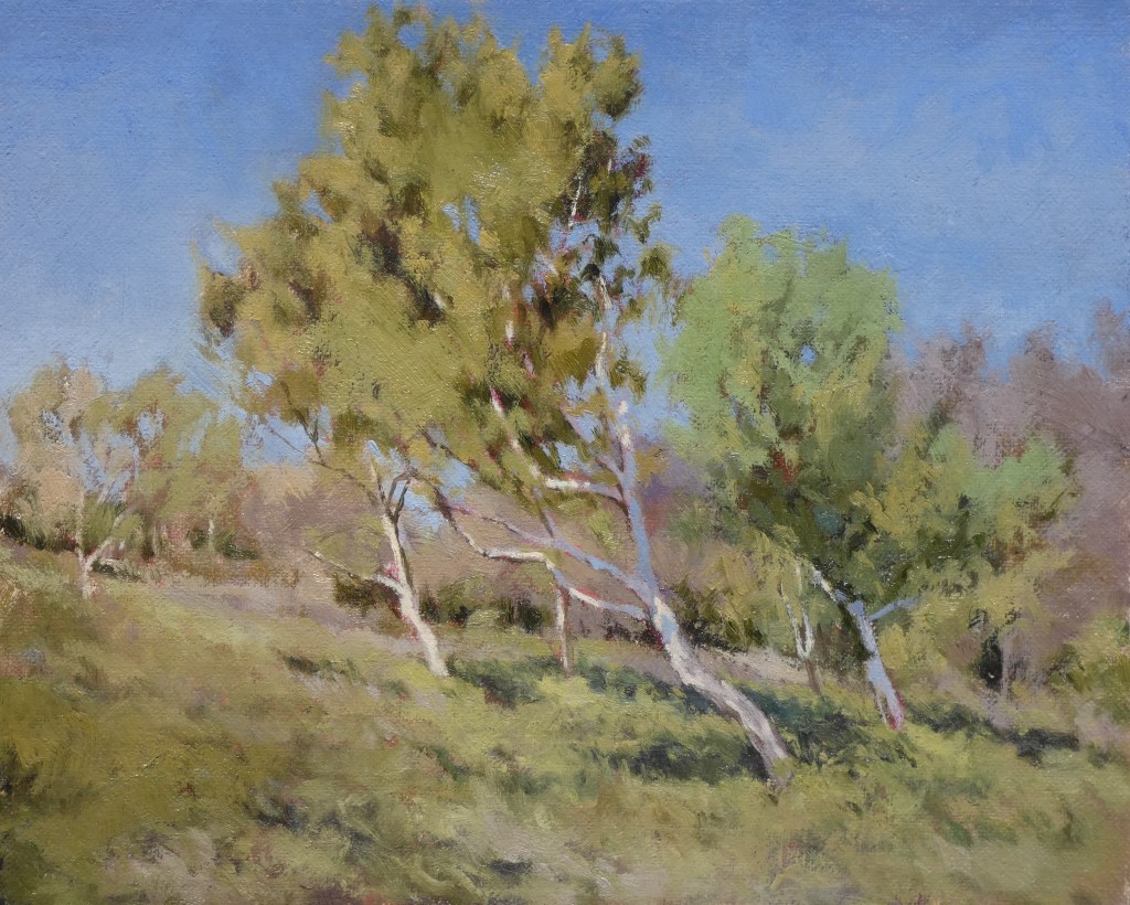
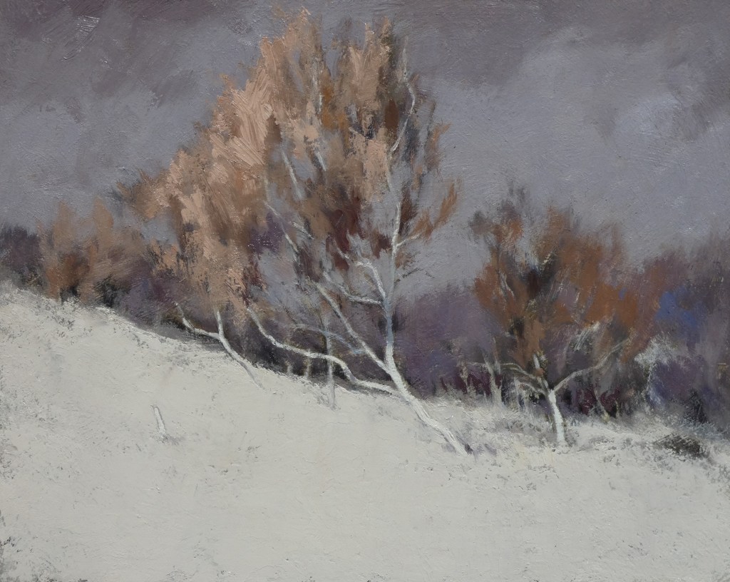
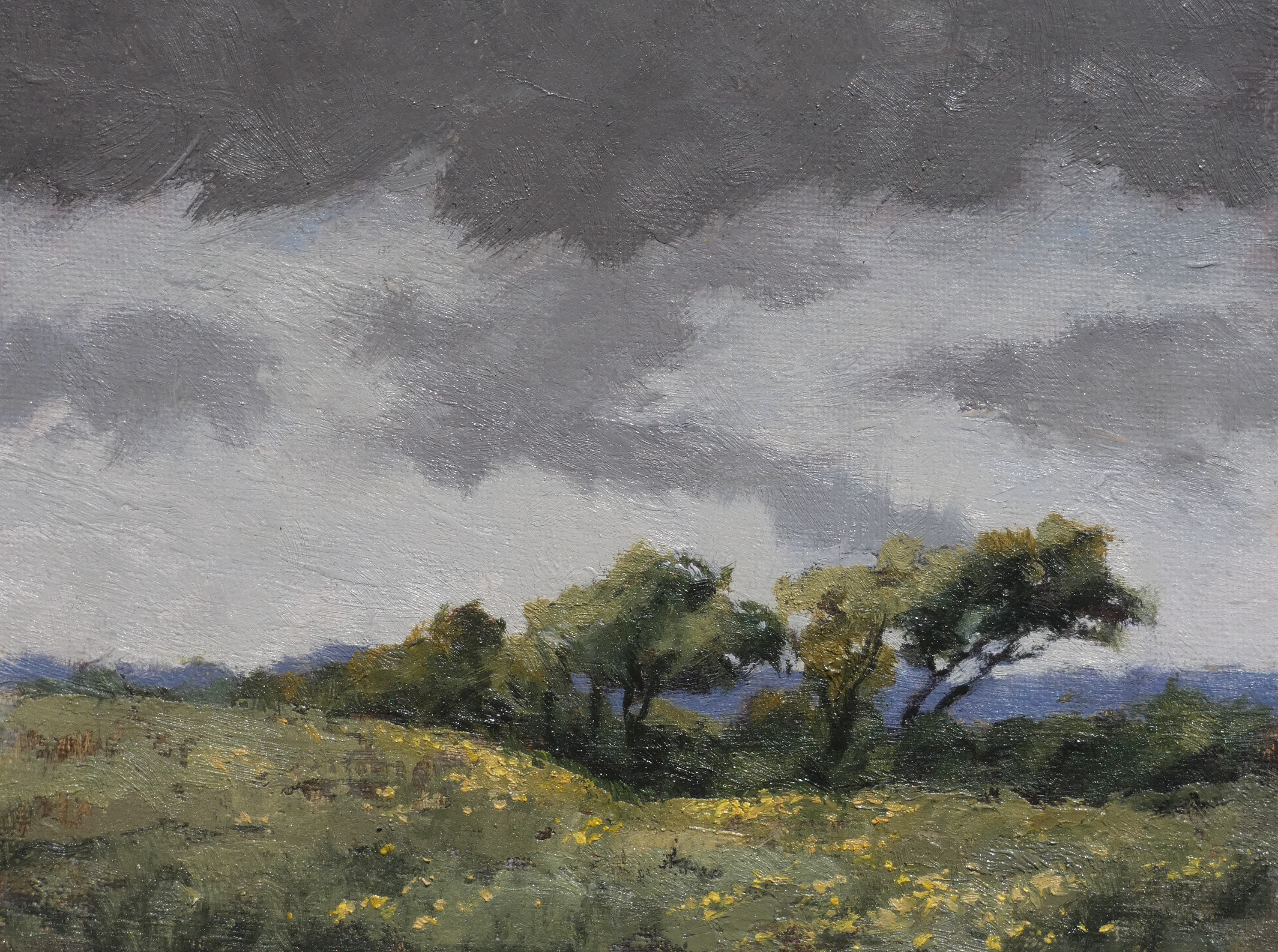
There’s a lack of silver birch trees in these parts. They lend themselves to painting, just look at Russian art, apparently you can’t step outside the dacha without smacking your nose into one. Their white bark stands out nicely against the green and the shadow of woodland. At Warren Glen in Hastings Country park however, where the ponies and Galloway cattle hang out, at the bottom by directional bollard 21, are a few decidedly pale trees. No idea if they’re birch trees or what but they’re making some aesthetic effort so I’ve photographed and painted them many times, in all three of our seasons in fact, spring, autumn and winter.

Roll On Summer
By the time you hit February winter has been going on a bit, like a bore at a party (remember parties? Other people used to have them, they sounded like fun) and it seems like everything will just be easier in the summer. Especially outdoor painting. You won’t have the time to do anything about it of course but if you did, it would be easier than it is now.
")


Method
Grass is tricky. No one has the time to paint every blade. Distance takes care of most of the problem, but the foreground needs something that says field rather than snooker table. And so are born a thousand methods for implying grass, which get repeated across the picture resulting in something that looks like an exercise in technique.
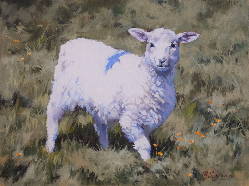
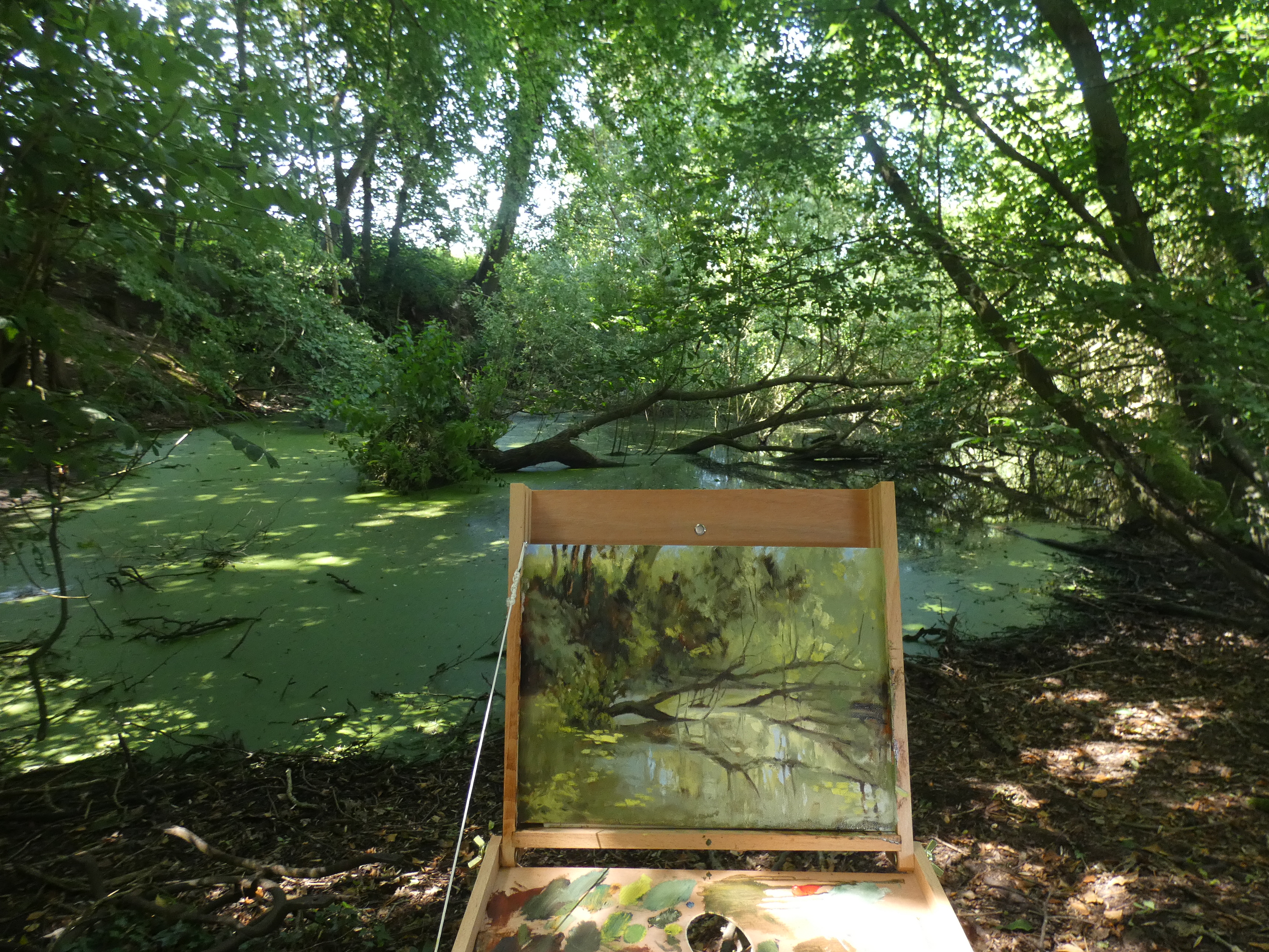
In the image below there’s a lot of ‘my method for painting grass’ used – three tones, shadow / mid-tone / highlight layered over each other, the introduction of occasional patches of slightly different colour, patches of flat colour fringed with individual grass blades to imply the whole lot is equally textured, etc. The degree to which it works depends on observation and concentration. Which is a pain, because who wants to spend time looking at grass, or expending as much effort on painting it as on the subject of the image? I was hoping a palate of terre verte, araratskaya green, yellow ochre pale, Italian black roman earth and warm white would do all the work for me. But no, you have to look at the stuff, and put dark where the dark bits are and light where the light bits are.
The astute observer will also have noticed another trick used, the introduction of a farm animal, which distracts attention from the foliage debacle. And obscures a lot of grass.
TURN YOUR BACK FOR FIVE MINUTES…
Oh dear. Someone must have called a meeting. There were probably flip charts. Maybe a Powerpoint presentation. A lot of buzz words were probably used. And so WordPress changed overnight. Just as I was getting the hang of the old system. It now operates using something called Blocks which are incomprehensible.
Uploading the following image was like wrestling with a belligerent digital octopus. It’s a scene in Cornwall, minus the crowds. Obviously I haven’t travelled there recently but a mate who has says it’s still packed.

All Over The Place
You’d think with Lockdown creating so much empty time that a dedicated, nose-to-the -grindstone effort would result, a glad embracing of a golden opportunity and a forging of a new style, a new direction.
Instead, just the usual reluctant trickle of images, all over the place. Here are some creatures.


")

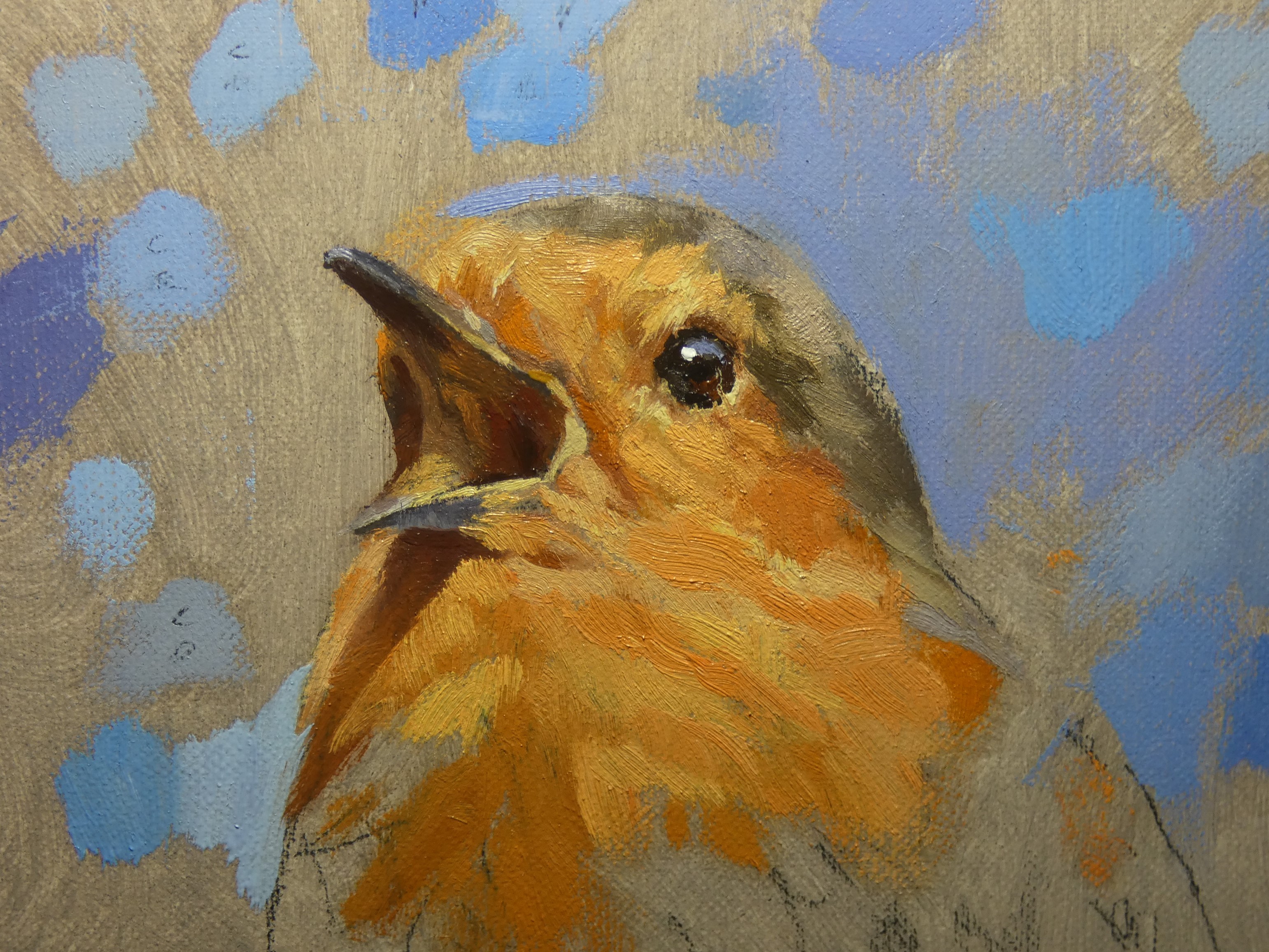
Quick, quick, slow…
Here’s two quick ones, and then a slow one just started – no way I could cheat a robin out of its feathery detail. Baulked at the idea of putting in all the leaves and branches though so it’s a plain blue background. Trouble is, which blue?

Low Boat to Clutter Ratio
There’s a lot of boats on Hastings fishing beach, posing heroically against the sunset and rusting mightily. Sometimes they go for a bit of a float in the sea, but mostly they sit on the pebbles and leak stuff. The boats are what you notice, they are after all identifiable. Until you try and paint them, when the background demands to be put in as well, at which point the question arises, what is all that clutter exactly? There’s loads of it, strewn about, piled up, stacked in blocks, it’s like New York in a seventies movie, or the front lawn of someone with a lot of children. No idea what any of it is. Boxes, cages, machinery, netting, tarpaulins, it looks sort of maritime, but not so much that you could name it or guess its function. My ignorance tends to show – next to something that is clearly a boat or a bulldozer for pushing the boat into the water will be a series of marks that are trying to give the impression of a stack of things, things that have every right to be where they are, but just look like a lot of hopeful brushstrokes.
At least I gave up on trying to paint all the pebbles a long time ago.
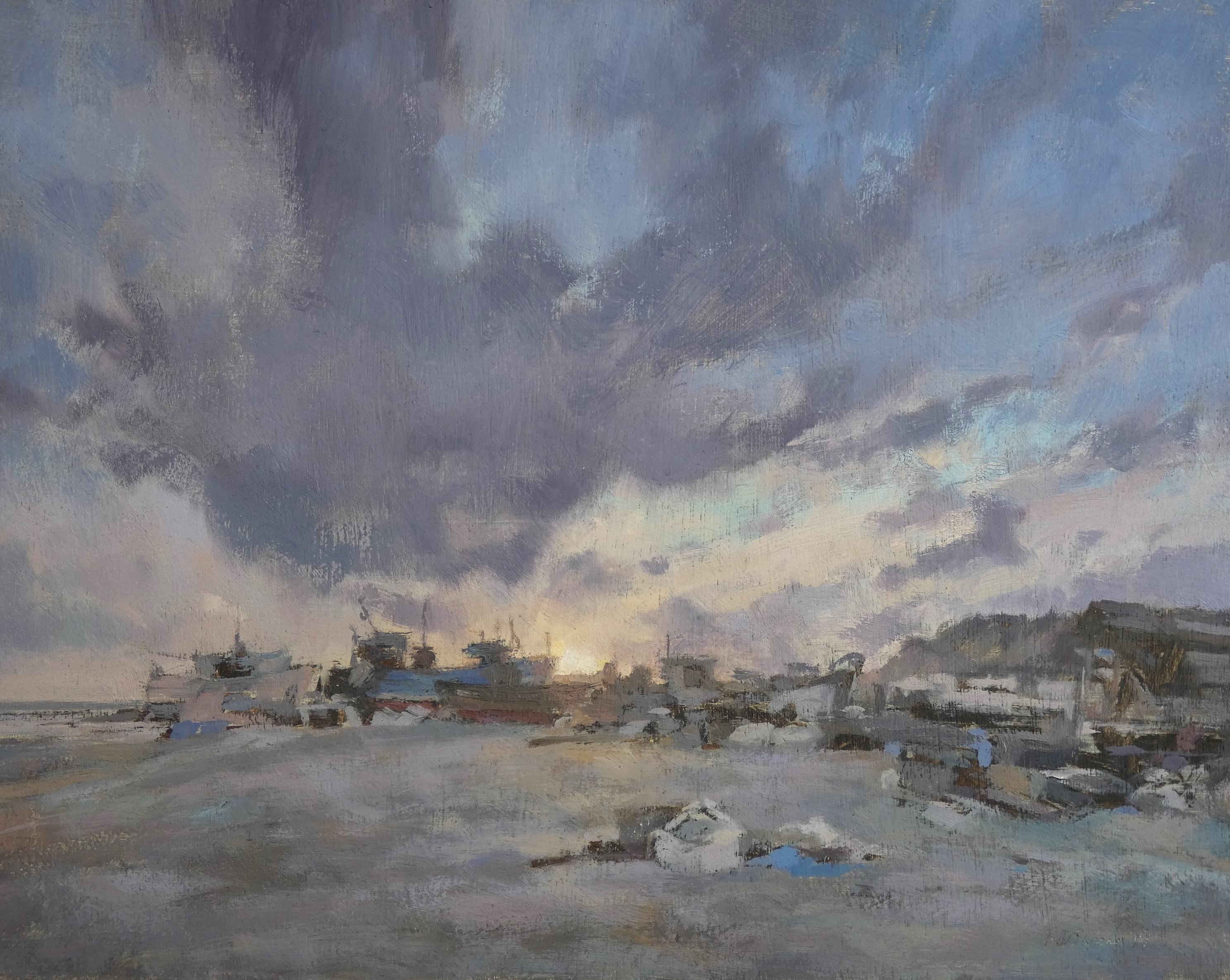
Sunset, Hastings
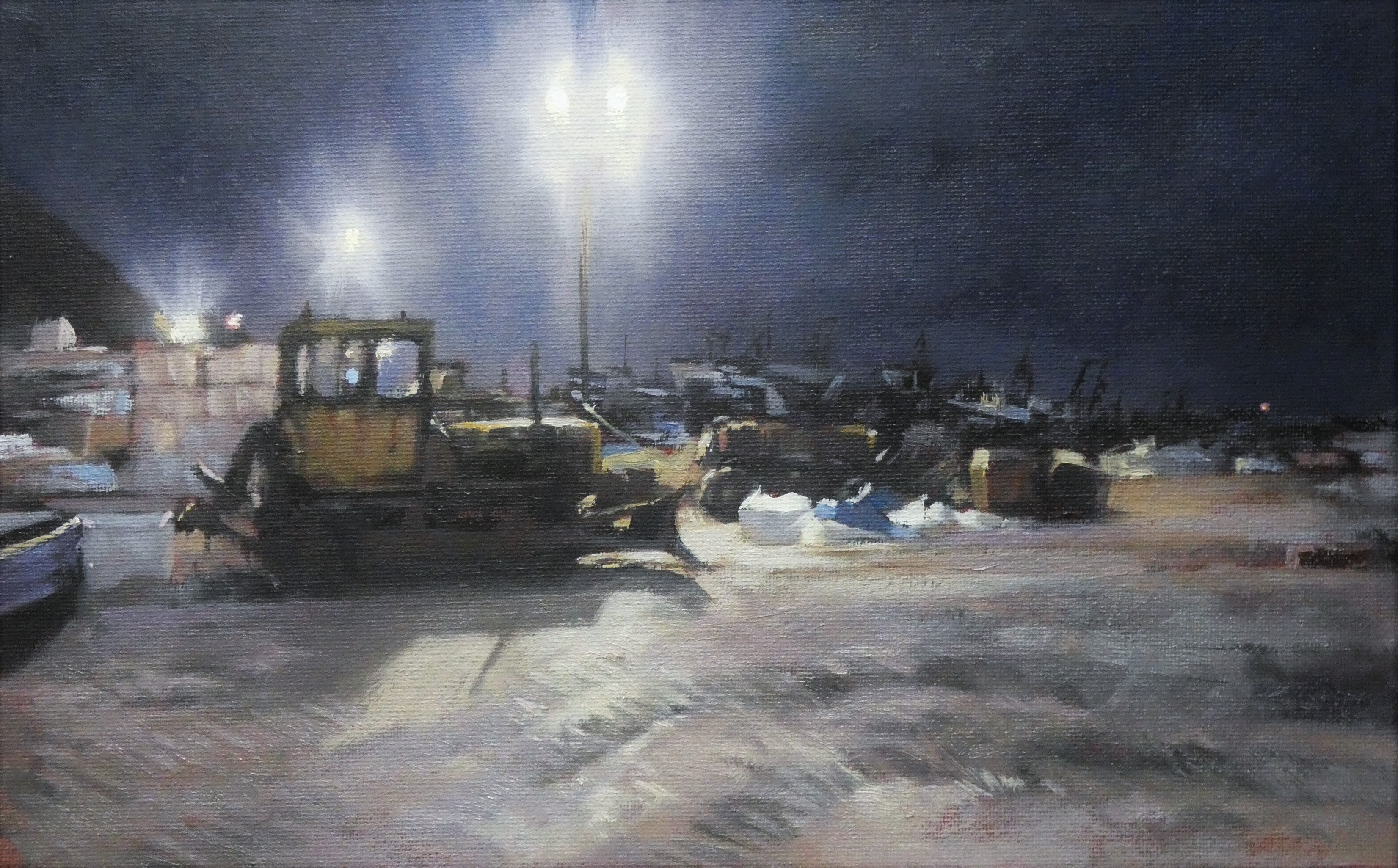
Hastings Fishing Beach at night
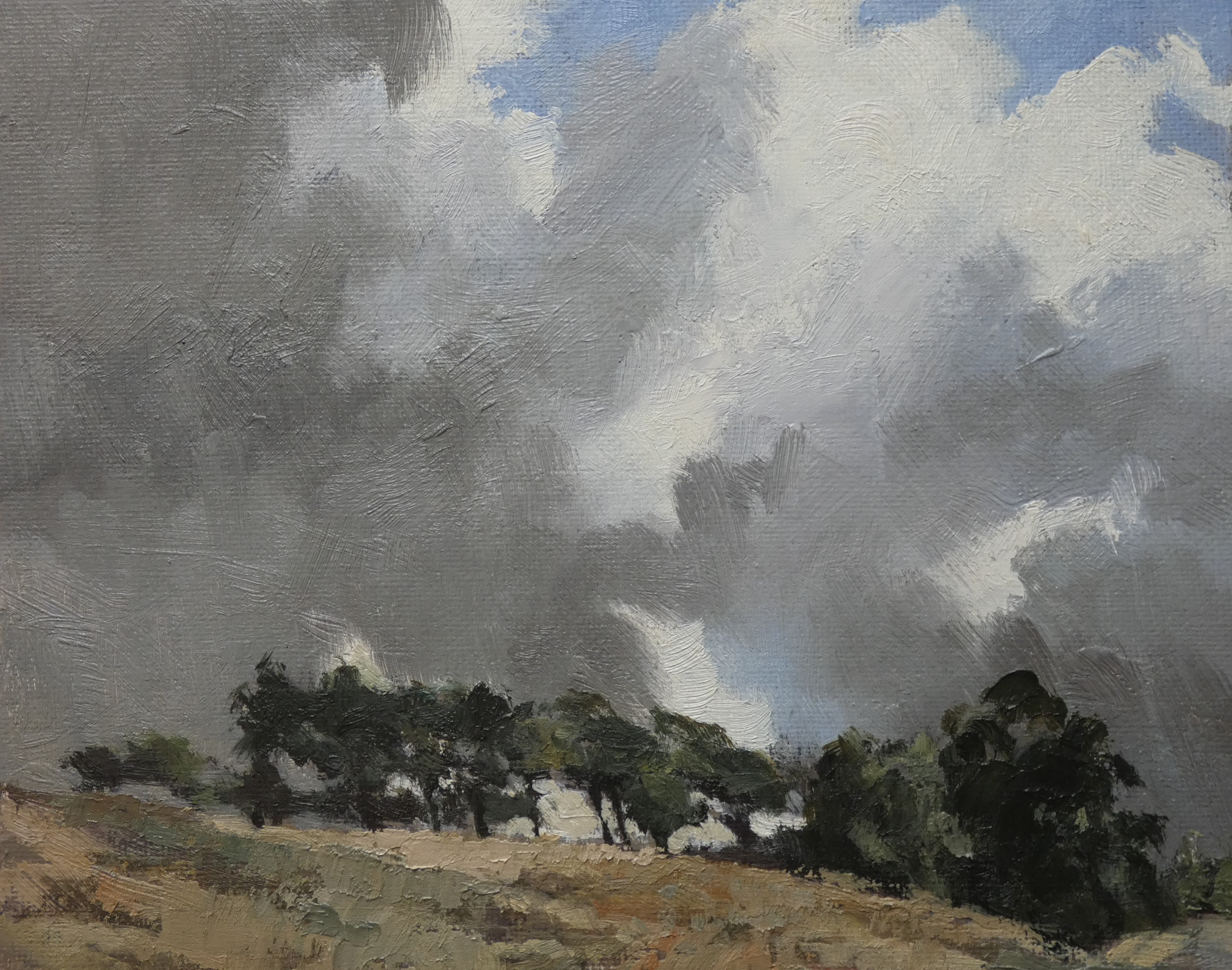
Blue Skies
The rule is, if it’s an outdoor painting day, there will be a solid grey sky like a sheet of Damoclean lead. All life and colour will be drained from the landscape. Any cows or sheep breaking the monotony will shuffle around to show only their backsides as if the artist is a wandering bum-magnet. Sometimes it seems as if the fields and hills are doing this as well. Any interesting wildlife will be asleep in a hole in the ground or flying away from you in the distance.
And if it’s a work day there will be skies full of drama, sunlight will breathe glorious life into the flattest of landscapes and magnificent herds of animals will sweep across the plains, the whole vista crying out to be painted, all of which you can see from the train window as you try and ignore the guy opposite eating a noisy breakfast of a chocolate bar and a can of Stella.
So far the rule for Lockdown seems to be blue skies, free time, a deserted world full of emboldened animals. And you’re not allowed out.
This is what I’d like to be doing right now:
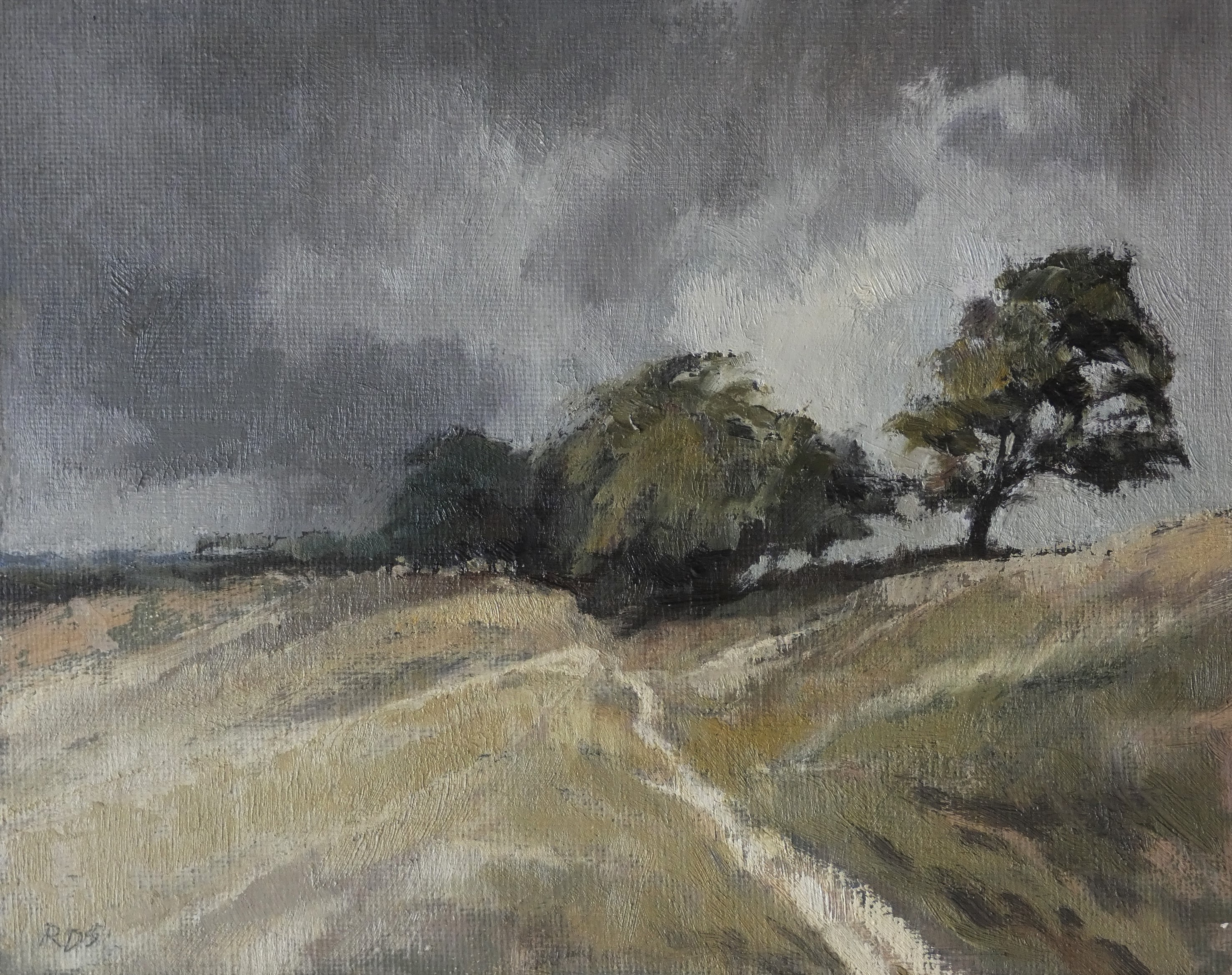
Nothing for it but to try and recreate the plein air experience by doing some oil sketches against the clock from old photographs. These are from a couple of years ago near Winchelsea. As you can see, it was about to rain.
Ponies Return
Five (or six, depending who you ask) Exmoor ponies have returned to the Hastings Country Park. Here is one of them. The things behind it are gorse bushes, not an artillery barrage.
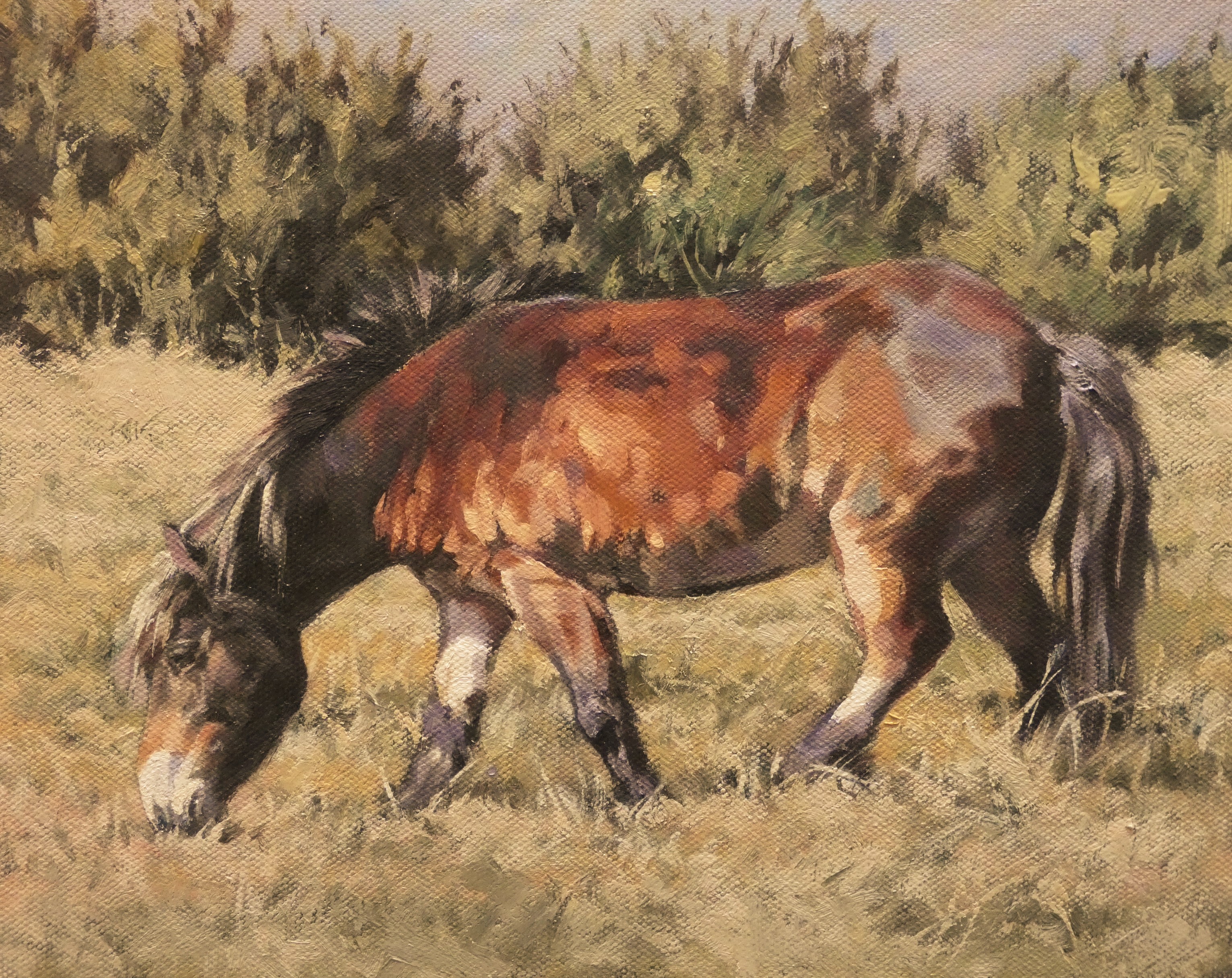
Exmoor pony in Sussex
The following images show that the hand-painted swatch around a quality tube of oil paint is one of the highest achievements of civilisation, and that you should always make sure your computer understands where it belongs in the hierarchy of stuff.
")

THAT TIME OF YEAR
Sir George Beaumont, a patron of Constable and noted amateur dauber in his own right, remarked that a good painting, like a good fiddle, should be brown. (He probably did anyway, it’s difficult to check even with the might of the internet – type in the quote misspelled with ‘ve’ instead of ‘be’ and it comes up, but type it in correctly and what comes up is mainly advice on how to paint kitchen cabinets. How did we manage before Google?)
In that spirit here are some subdued colour paintings. It is after all that time of year when everything is as colourful as your oldest underpants just before all the holes finally join and leave you with a band of elastic around your waist and the rest hanging off one foot.
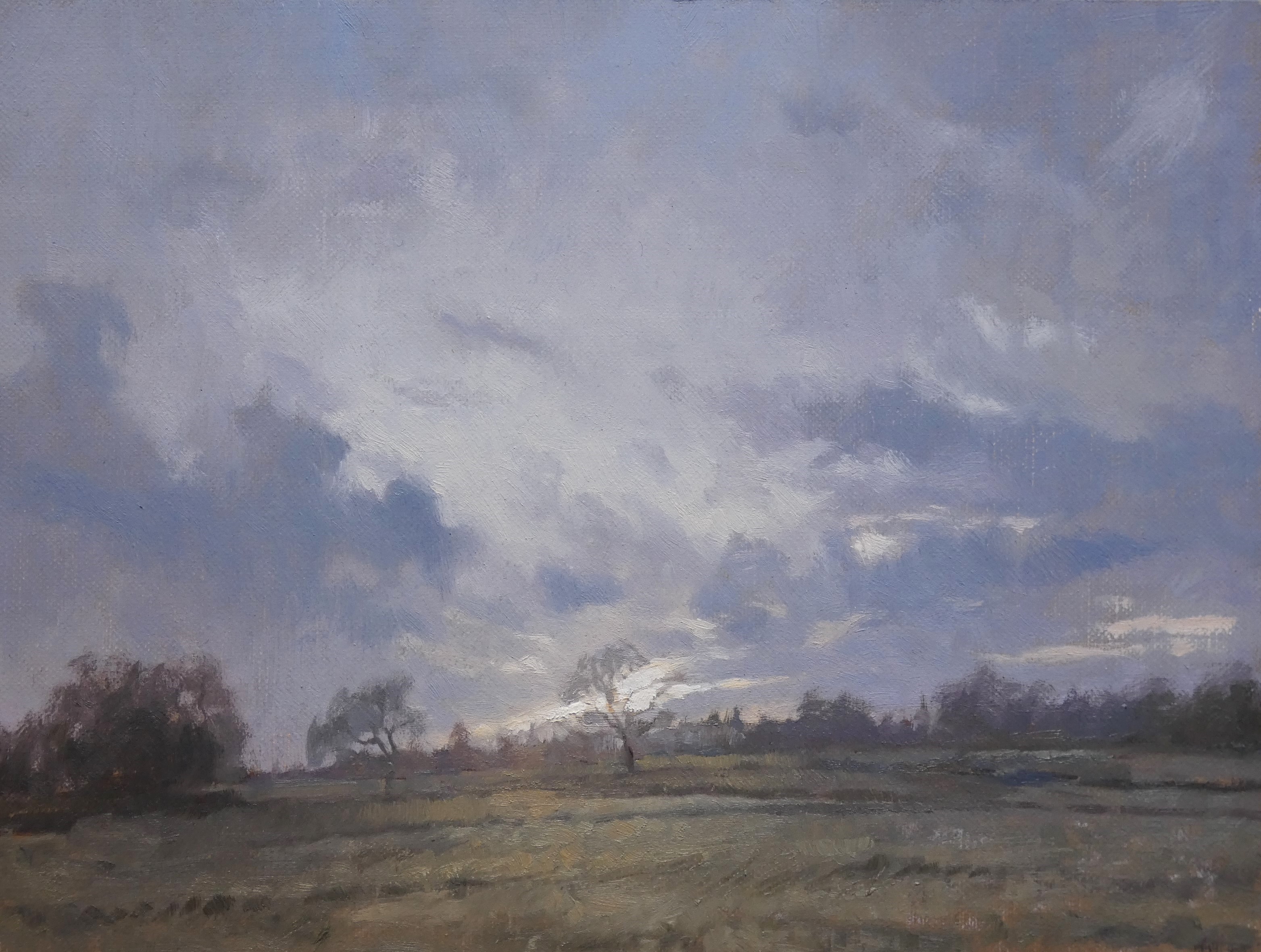
Sundown
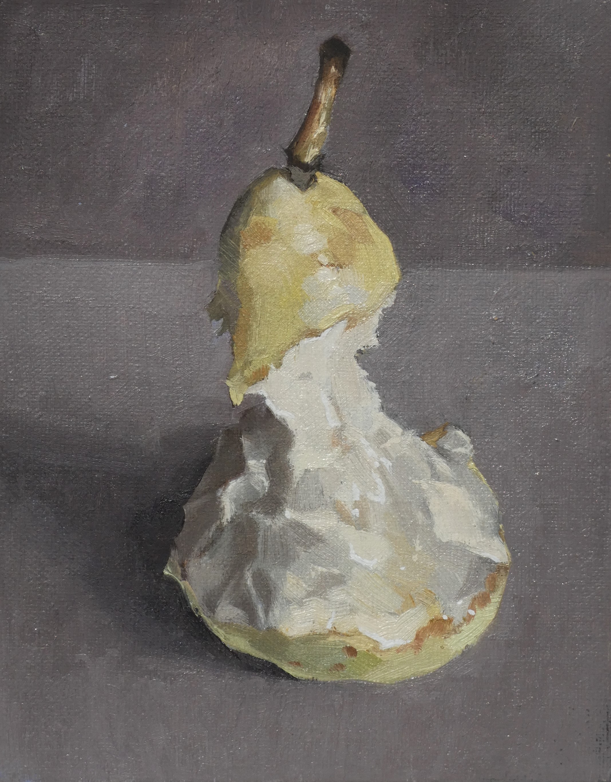
Pear
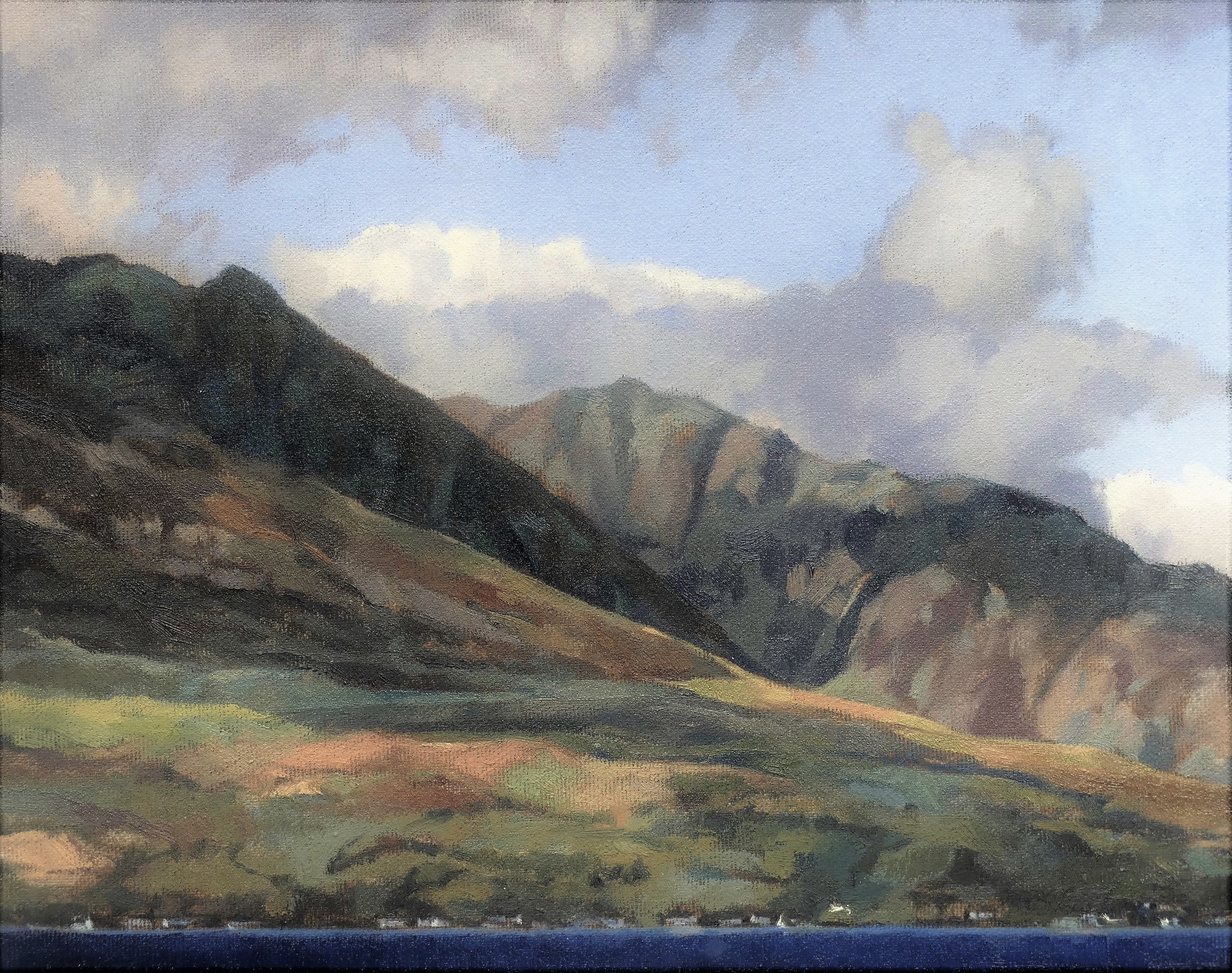
Arran
